A React UI kit for dashboards and settings.
Build a dashboard or settings screen from the same tenvell controls used in the live catalog: metric cards, inputs, selection controls, tabs, menus and dialogs. The thin-glass surfaces and local typography give these pieces a shared visual language.
Compose the screen from documented primitives
Use the Card family for metrics and grouped settings, Input and Select for filters, Tabs for local navigation and Dialog for detail views. Keep the product layout and data model in your application.
The full dashboard example demonstrates a composed product screen with fictional data. Its source is available in GitHub. The portable core is the documented component set; the complete dashboard is not a standalone package export.
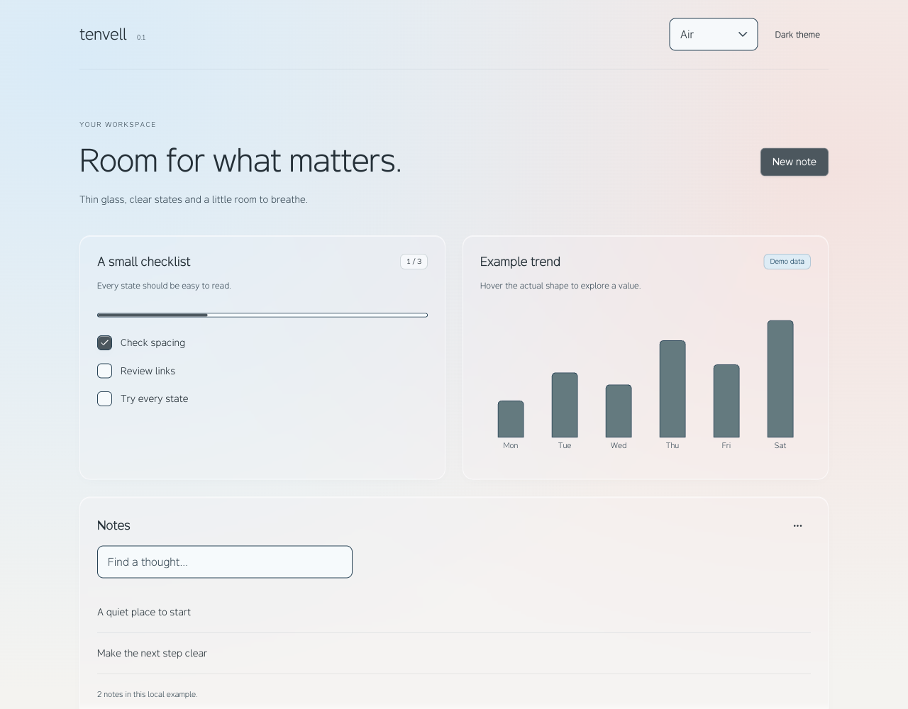
Add charts when the screen needs them
Optional GlassBar, GlassDot and GlassSector shapes work with Recharts 3. Give responsive charts a nonzero height and keep Tooltip cursor={false} so highlighting follows the actual element.
The downloadable starter already includes a chart, local notes and a checklist. It is a runnable application with locked dependencies and the published tenvell tarball.
Keep business behavior explicit
A UI kit supplies controls and presentation. Connect filters, saving, loading states and data access to the actual product requirements. The demonstrations keep changes in local state and do not provide a production API or database.
A useful fit when
- You are building a React 19 product dashboard, settings screen or internal tool.
- You want cards, controls and overlays to share a calm glass material.
- You want to own the layout, data model and source code.
Know the export boundary
- The website Calendar, DataTable and toast examples are not core package exports.
- The full dashboard, messenger and task board are source demonstrations.
- Recharts is a separate optional dependency; the core can be installed without it.
Start in your project
npm install https://tenvell.space/releases/0.2.1/tenvell-0.2.1.tgzimport { TenvellProvider, Card, CardHeader, CardTitle, CardContent } from 'tenvell';
import 'tenvell/styles.css';
export default function DashboardCard() {
return (
<TenvellProvider theme="light" surface="air">
<Card>
<CardHeader><CardTitle>Active projects</CardTitle></CardHeader>
<CardContent><p>12</p><small>Local example data</small></CardContent>
</Card>
</TenvellProvider>
);
}Common questions
Is this a complete admin framework?
Tenvell is a UI kit. Routing, authorization, persistence and business workflows belong to the consumer application.
Can I begin with a running application?
Yes. The starter archive includes the package, a lockfile and an editable screen. Follow the installation guide to run npm ci and npm run dev.